Responsive Inspector (beta) released!
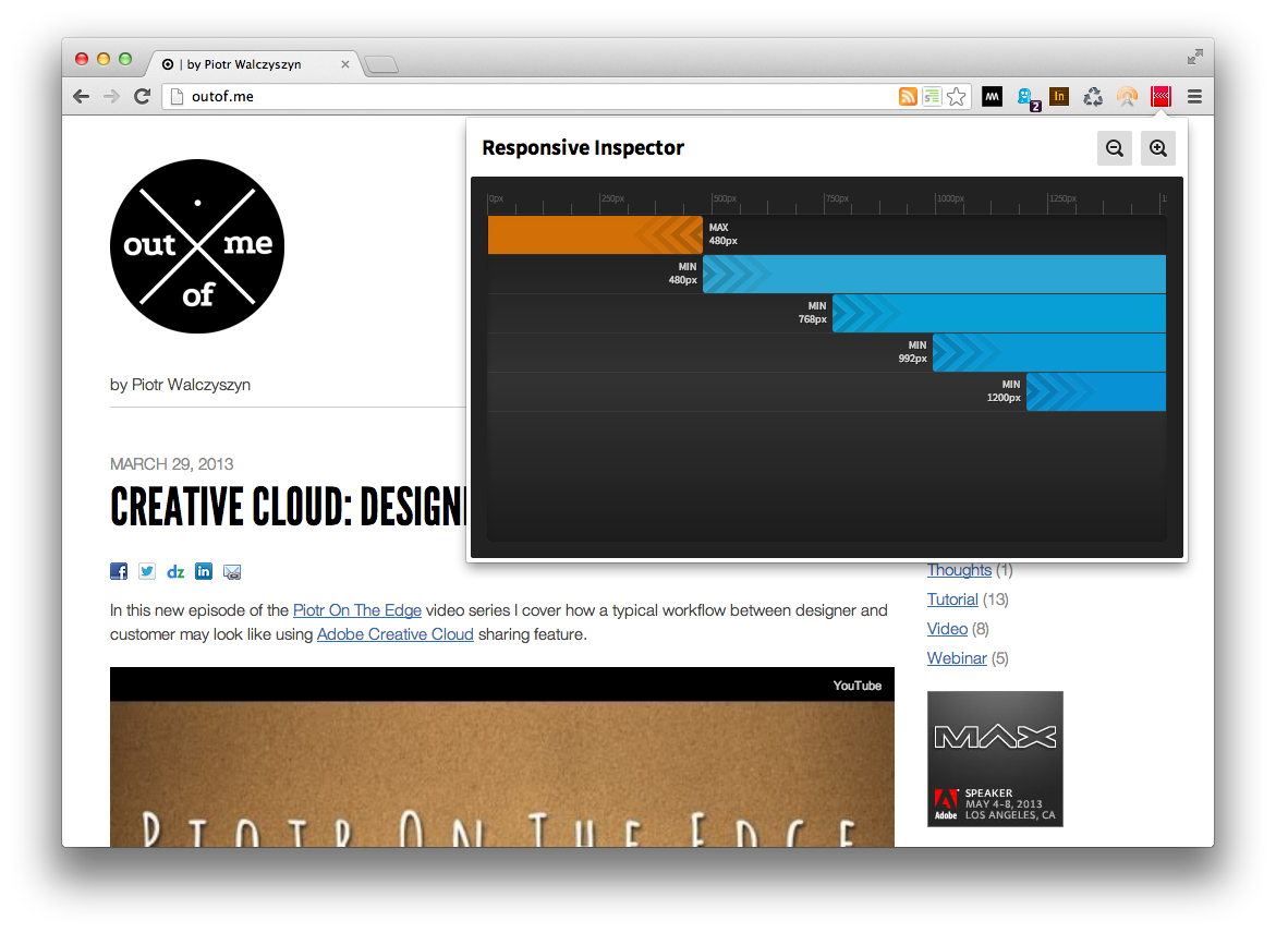
 I’m really proud to announce a beta release of Responsive Inspector extension for the Google Chrome browser. It’s a little side project that I’ve been working on together with Filip Łysyszyn – a colleague from Adobe and a great UI/UX designer. In a nutshell, Responsive Inspector allows viewing defined media queries of visited websites. It is very useful when developing responsive web layouts as it can show what
 min-width or max-width media queries are specified in CSS stylesheets. In addition it also enables pixel perfect browser resizing, taking and saving whole page screenshots, CSS media query code viewing, and sharing web designs on Behance service as Work In Progress.
You can find it here in the Chrome Web Store. Remember it is a beta release, so if you find any bugs or you would like to share your feedback with us you can use this contact form. Below you will find a screen shot of Responsive Inspector in action and a short video with an overview of all of its features.