Responsive Inspector (beta) released!
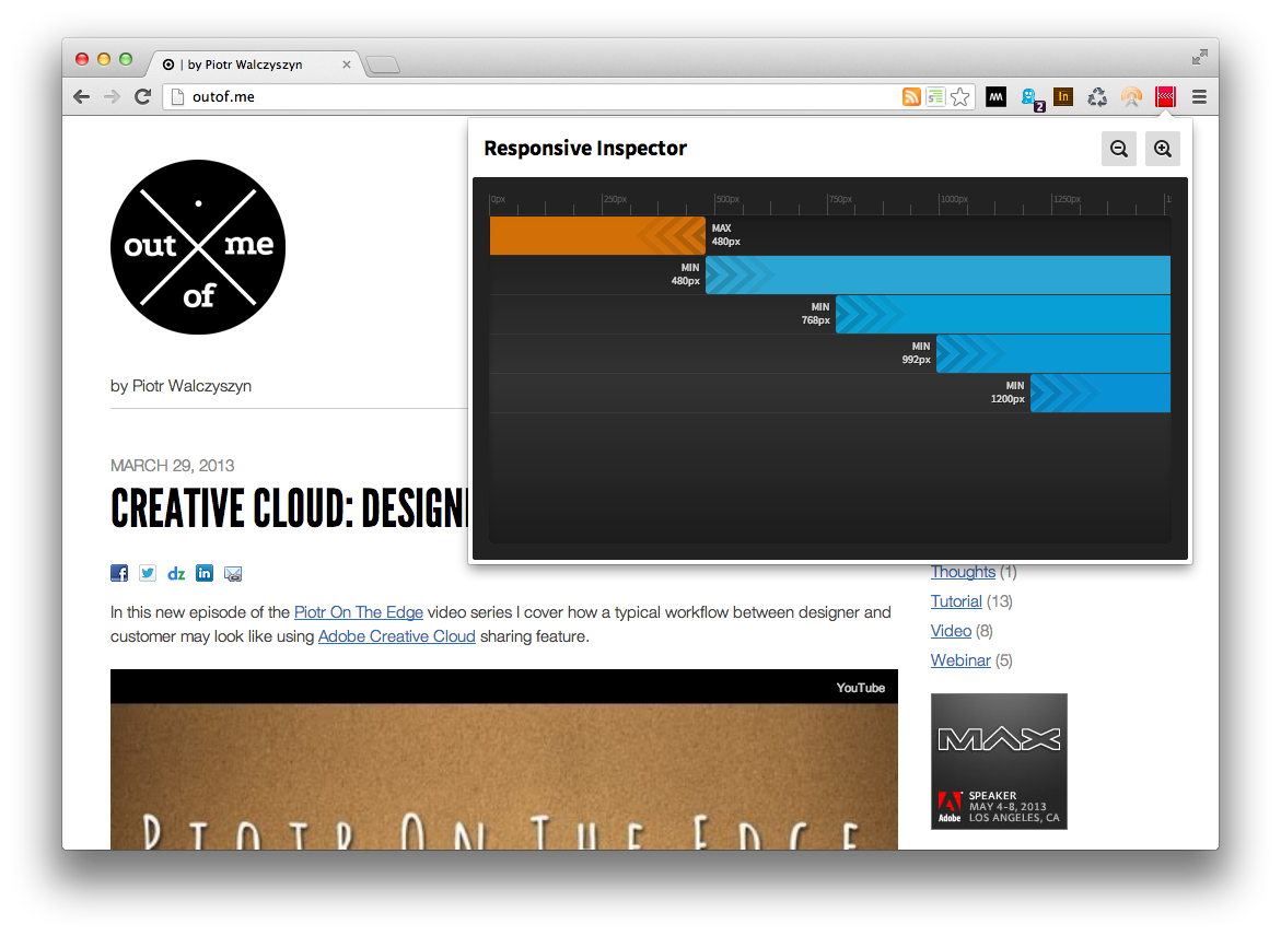
 I’m really proud to announce a beta release of Responsive Inspector extension for the Google Chrome browser. It’s a little side project that I’ve been working on together with Filip Łysyszyn – a colleague from Adobe and a great UI/UX designer. In a nutshell, Responsive Inspector allows viewing defined media queries of visited websites. It is very useful when developing responsive web layouts as it can show what
 min-width or max-width media queries are specified in CSS stylesheets. In addition it also enables pixel perfect browser resizing, taking and saving whole page screenshots, CSS media query code viewing, and sharing web designs on Behance service as Work In Progress.
You can find it here in the Chrome Web Store. Remember it is a beta release, so if you find any bugs or you would like to share your feedback with us you can use this contact form. Below you will find a screen shot of Responsive Inspector in action and a short video with an overview of all of its features.


This is really interesting, using it on my own website show a lot of MQ values…
Could we have the option to save the screenshot in PNG format instead of JPEG?
Thanks for your feedback, yes PNG is possible, I think I will add configuration option in the next major release and it will be set there.
Lovely tool! I like how it highlights only active CSS for a certain breakpoint.
Suggestion for the developers: how about adding an option to be able to export just the active CSS for a certain breakpoint into a separate file?
Thanks for your feedback This feature is actually on my list for 2.0 release.
Awesome!
Looks like it would be easy to convert your code to run as a bookmarklet as well, so it’s available on all browsers. Kudos, great work Piotr!
For MQ visualization yes, unfortunately other features like screen shooting or browser resizing would not work.
But that’s a good point, maybe I should release lite version without some features.
p.
For screenshots, you could utilize a web service, simply by passing the page’s URL. E.g. http://url2png.com/
Good point!
… Except that would only work for public URLs 😉
Lovely stuff! It would be nice if any currently-active media queries could be highlighted so you know what styles are currently applied.
Would be very nice to see a pixel density simulator integrated (for retina and other HD displays).
Thank you for this! It’s incredibly helpful to be able to take screenshots at different breakpoints, especially of local work. Great stuff.
Cool features but I can’t open snapshot image (jpg) into Photoshop!
“Could not complete your request because an unknown or invalid JPEG marker type is found.”
Thanks for pointing this out! I see same problem on my machine, I guess it’s some crazy Chrome thing! I guess I will have to switch to PNG export 😉
Looks interesting
I am going to try it little more today in current project, thanks
Really nice tool. Could be very helpful.
Thanks for the work!
+1 for .png support
It’s coming 😉
Nice tool, I would love if I could dock the navigation to the browser. The window closes every time I move the window or resize the browser.
That’s a limitation of Chrome, I’m actually thinking to have an option to open it in Web Inspector view instead/or both.
That would be awesome. There is a tool that I use called Pixel Perfect that works in Chrome and docks to the browser on the right side. However, the web inspector view should be a better move if you can get it in the web inspector view. Keep up the good work.
When I tried using it to size to the media queries on my website the [] button did nothing. The screenshot button would scale it to the right size and take the picture, but then went right back to full width. Version 26.0.1410.63 of Chrome, Linux Mint 64bit for an OS.
really interesting and handy tool to use for my future projects. All the best.
Hi Piotr…thanks for creating this tool! I did notice however that vertical media queries weren’t indicated in the inspector. Do you plan on including this in a future release?
Yeap, vertical media queries are in scope for 2.0 version, which I’m currently working on
p.
+1 for PNG support as well. Simply because of the Photoshop problem 😉 (wanted to optimize the image for email attachments)
Fantastic. thanks
OFFTOPIC. Please, use DeEsser on the audio in the video… next video.
Just stumbled across this tool from the html5weekly newsletter, installed the tool and will find it handy for future projects, thanks.
Awesome tool! I’m excited to use it, but the inspector doesn’t seem to recognize the media queries on the websites we build. Here’s one example: nantucketchronicle.com
I think figured out what the root cause of the issue is. When css files are loaded via the @import method instead of the style tag, Responsive Inspector does not recognize media queries in those css files. Our sites are built with Drupal, which uses the @import method when the site is under development, and then switches to a single aggregated css file that is loaded with the style tag for production sites. It would be awesome if you can figure out how to load css files that are @imported.
This is such a useful tool, thank you, Piotr.
Before I install, let me say guys how happy I am for your family names! Grzegorz Brzęczyszczykiewicz. Chrząszczyżewoszyce – powiat Łękołody
Hey Piotr,
Love the Responsive Inspector. I’ve got some ideas on how to enhance it. Is the source on GitHub?
Yeah it’s in GH, I just made the repository publicly visible
https://github.com/pwalczyszyn/responsive-inspector
Hi,
This looks like a great extension, however, it would be great, if you’d add support for WordPress themes. Looks like the tool cannot cope with @imported CSS and, because of that, doesn’t show any MQs. That’s a pity.
Cheers,
t
Hi Torsten,
I think is should handle @imports, if it doesn’t there is bug 😉
p.