Tagged: Responsive Inspector

Video Series – Getting Started With Reflow

As you probably know already, Adobe has just released a preview version of Edge Reflow CC. Just for this occasion, I recorded a series of five video tutorials that will guide you through your first steps with this awesome tool. You can watch the whole series in the embedded player below or you can view each video using the following links:

  1. Intro – This is the introductory episode of the Getting Started With Reflow video tutorial series. It briefly covers the basics of Adobe Edge Reflow as well as navigation within the tool.
  2. Defining Layout – This episode covers the first steps of the Getting Started with Reflow tutorial series. It shows how to use Reflow to define layout of your responsive design.
  3. Styling Elements – This is the third episode of the Getting Started with Reflow video tutorial series. It goes over the styling capabilities of Adobe Edge Reflow.
  4. Making Layout Responsive – This is the fourth episode of the Getting Started with Reflow video tutorial series. It covers an essential part of Reflow — making your layout responsive.
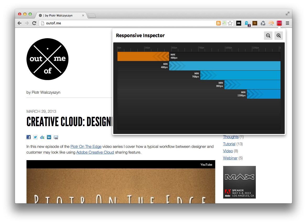
  5. Testing Layout – This is the final episode of the Getting Started with Reflow video tutorial series. It covers techniques for testing your design on different devices using Edge Inspect and Responsive Inspector tools.

Chrome Extension + Retina + captureVisibleTab + translate3d = 2 x res

As you may know, recently I’ve been dealing with Chrome Extensions and their APIs quite a bit. This is because I’ve been working on my Responsive Inspector tool. (If you haven’t seen it yet and you are into Responsive Web Designs I recommend you check it out!) Overall I had a great experience with the Chrome Extensions API, except for just one function that really gave me a hard time. This function is captureVisibleTab, which is a key to whole page screen shots feature that I implemented in Responsive Inspector.

The issue I experienced with it was that on some sites the captured screen shots had double the normal resolution. This was only happening on my MacBook with Retina display, and not on every site. On the sites that had this issue, I started isolating the problem element by element and I discovered that the root cause was a translate3d transformation. To work around this problem I included a div element with transform: translate3d(0,0,0) in a page that embeds in an iframe the captured site so that every screen shot had doubled resolution no matter if it used translate3d or not.

Next I called canvasContext.scale(1/window.devicePixelRatio, 1/window.devicePixelRatio) on the Canvas Context that I drew captured image into. This scaled screen shot to proper resolution, and the latest version of Responsive Inspector (now available in Chrome Web Store) runs like a charm on Retina MacBooks :)

Responsive Inspector (beta) released!

Responsive Inspector logoI’m really proud to announce a beta release of Responsive Inspector extension for the Google Chrome browser. It’s a little side project that I’ve been working on together with Filip Łysyszyn – a colleague from Adobe and a great UI/UX designer. In a nutshell, Responsive Inspector allows viewing defined media queries of visited websites. It is very useful when developing responsive web layouts as it can show what min-width or max-width media queries are specified in CSS stylesheets. In addition it also enables pixel perfect browser resizing, taking and saving whole page screenshots, CSS media query code viewing, and sharing web designs on Behance service as Work In Progress.

You can find it here in the Chrome Web Store. Remember it is a beta release, so if you find any bugs or you would like to share your feedback with us you can use this contact form. Below you will find a screen shot of Responsive Inspector in action and a short video with an overview of all of its features.

Responsive Inspector screen shot